I wrote recently about which comes first, your packaging design or your copy. In case anyone thought that I don’t love what the designers do, I wanted to share some great example from a recent trip. These are things where I think the design really enhances the story behind the products and brand. See if you agree.
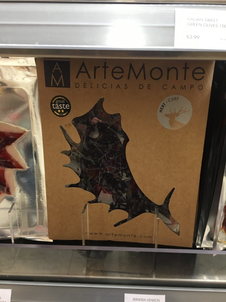
Arte Monte – gourmet products from game
Sometimes the simplest ideas are the best. Given a significant proportion of the range is based on deer then I thought it was a great use of the antler as a motif and to give visibility of the product. I’d have loved it if they could have found a way to use different animal motifs for the different meats, but perhaps they wanted to have the consistency of presentation.
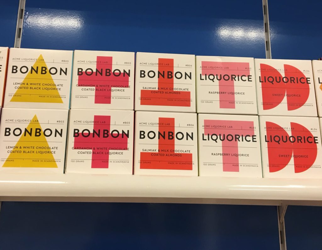
Liquorice and Bonbons from ACME Liquorice Lab
While these aren’t new to the market, I really like the impact of colour and the strength of design. You can’t miss these on a shelf, and with some very distinctive flavours, the challenge might be on deciding which one to choose. The founders are Danish and Swedish, so it could have been that they took a more traditional Scandi approach to design. Given that they are reinventing our expectations of what liquorice is, then this is perhaps more in keeping with the story.
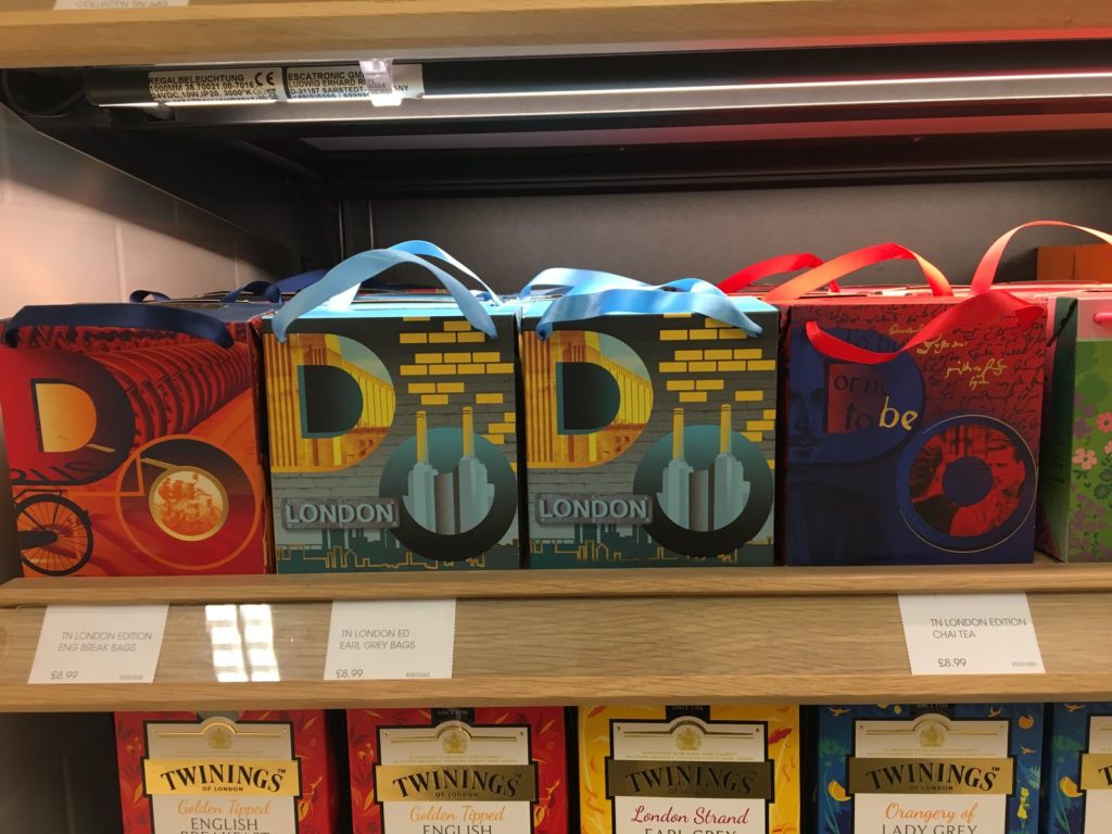
Twinings break with tradition
Not the best photo, but I was intrigued by these new gift packs from Twinings. This is such a traditional brand with a long history, so it’s great to see them doing something a bit different. The packs all showed iconic London buildings including Battersea Power Station and the London Eye.
While focused on the tourist gift trade, they haven’t taken the twee heritage route, so often beloved of shortbread brands. Contemporary enough to be fascinating, with enough British roots to hold onto the brand history.
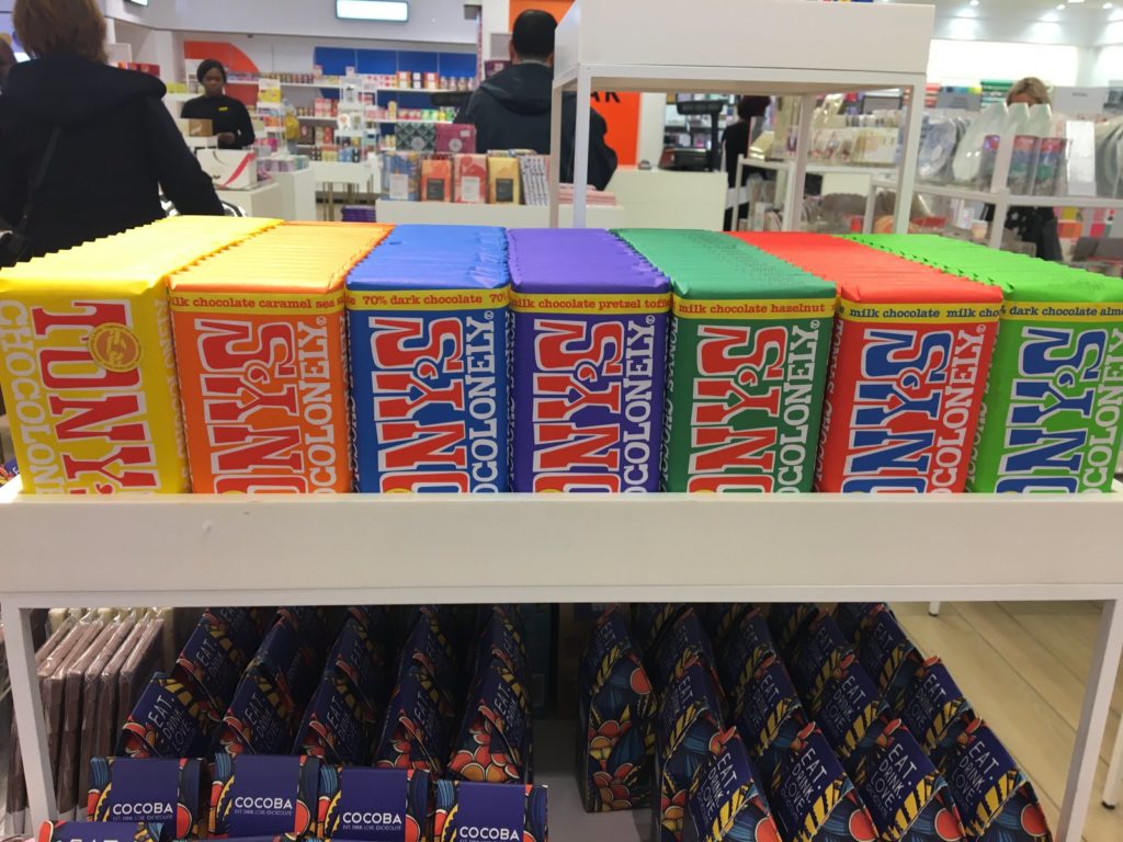
Tony’s Chocolonely Add Colour to Chocolate
I am so thrilled to see Tony’s Chocolonely now being available in the UK. This is a brand with a strong story, an ethical thread running through it, and then darned tasty chocolate to boot. These are big flavours, and the design is big and bold. Crazy about chocolate, serious about people. I think they follow that through with design.
If you’ve not tried this before, I would recommend a bar or two if you spot it. Dark Almond Sea Salt would be my choice.
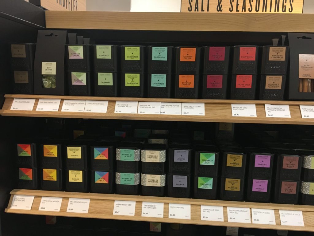
Why should spices be dull and shades of brown?
Mill & Mortar started in Denmark in 2008, but are new to me. This shakes up the category cues of spices to me, moving beyond where someone like Steenbergs. This livens things up even more, but also has some practical applications. Opaque packs are better for keeping the spices in better condition for longer. The distinctive colours mean you’re unlikely to end up with the wrong spice by accident.
This made me want to replace all my old school Barts jars. But then I’m a sucker for packaging with impact.
Just five that caught my eye, that I think enhance their brand stories. It might be that it’s through the clever use of colour, or the cut out of logos, or just really bold typography. I think they are all captivating, eye-catching, and clever use of design. Stories and design working together have such power, particularly when you’re clear on your story, and then brave in your design choices.
