
What’s the smallest space your business owns?
We’re often focused on the big spaces, the big things. The places where you can tell your story in huge letters or at great length. We agonise over what to put on billboards or the side of our delivery lorries.
But the smallest space is the one your customers often see first, and it’s almost definitely the one they see most often, particularly in their own home.
The art of the label
When we think about the design of product labels, it’s often about the graphic elements: the logo, the colours, the font, the brand name. Don’t get me wrong; they’re all significant. Nor is this a bitter tirade from a copywriter feeling our “art” is often overlooked.
Just it often is. All those elements go through months of debate and sign off, yet the words get left until last and are often squeezed in as an afterthought.
Good copy won’t necessarily make up for bad design
If there’s nothing to catch the customer’s eye in the first place, it probably doesn’t matter how brilliant your copy is. If your product isn’t in their hands, or they haven’t taken a step closer to the fixture to have a proper look, the words may as well not be there.
Good design and bad copy can work
But why disappoint someone? Not to mention not fully utilising your real estate on any shelf your product appears on. Yes, your design makes you distinctive from the other things around you. The words you choose to use can add to that distinctiveness.
Telling your story in a short, succinct way gives the customer another reason to try you the first time. Connecting to stories also helps to inspire loyalty, as long as your product has delivered as well. The right story inspires empathy, and we’re more likely to stick with those things, those people and brands that we feel empathy for.
Put the smallest space to work
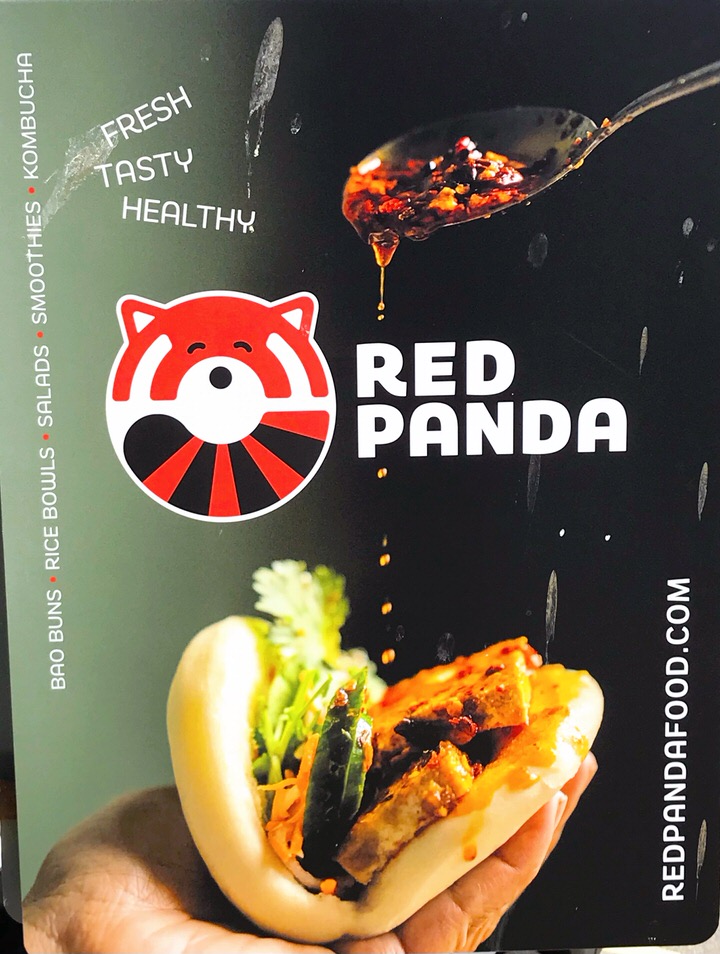
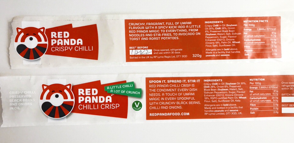
I updated a product label for a client, Red Panda, recently. The previous version is perfectly serviceable, told the customer what they needed to know.
What it didn’t do was tell the story of why this was so much more than a crispy chilli oil. In fact, that product name didn’t even really tell the story of what the product was all about. It’s a challenge, though, when the customer recognises that type of product by that name.
Just enough everywhere
The front has to be enough on its own. Most people won’t turn your product around in a shop; the decision will already be made. You can’t rely on the back of the pack to tell the story. The front has to have just enough to entice and intrigue.
The back can tell your story in a bit more detail, or a lot (following the Oatly kind of route). Just make sure it’s stuff that’s interesting to the customer, and not just to you. Make it work with the personality of your brand, and give it something that connects with them.
With Red Panda, I wanted to make sure people got that this is a multi-purpose condiment, not just something to stick on top of rice. In this household, it gets used on everything from roast potatoes to cheese on toast.
Audit the smallest spaces
Go back and look at the spaces you’re not utilising at all, or perhaps not to best effect. Every space you have has the opportunity to work hard for your business. Look at brands like Glossier with their pink bubble wrap and stickers. Think of it all as an evolution of the Innocent school of copy.
And then go make that smallest space tell your story in a way no one is expecting, but everybody loves.