How long does it take you to decide to buy something new in the supermarket?
Do you stand and read all the lovingly crafted copy on the front and back of the product? Do you admire the beautiful design, the quality of the packaging, all the little details that make up the lovely looking thing in front of you?
Of course you don’t.
Three-quarters of a second is probably overstating how long it takes people to make the decision. That’s why all those elements are critical, as subconsciously people have noticed those things.
Done right though, packaging copy can cause a reaction. I mean, you could hardly ignore these:
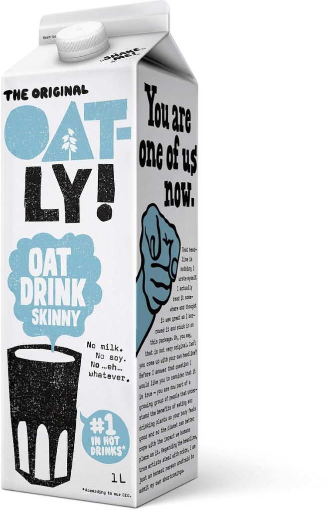
Oatly
I think Oatly is probably the 21st-century version of innocent, who impacted how packaging copy was written for many years after. There’s plenty of words on these boxes, making even the dull regulatory type information relatively interesting.
The Ordinary
Simple, straightforward, ingredient-led. Pretty much all you need to know about how The Ordinary write their copy. Stripped back in every sense, from packaging to words. You know it’s impactful when you can see other brands drawing parallels.
Waitrose own brand herbs
I think this style goes across quite a few categories in Waitrose, but I’ve always liked the simplicity. Most people will just look at the herbs themselves, or the name. If they dig deeper for a millisecond, the information is interesting but snappy.
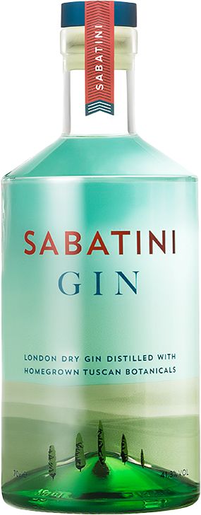
Sabatini Gin
There are so many examples I could pick from my favourite spirit category. What I love about this one is getting all the elements working together: clever use of graphics, choiceful selection of words. Sometimes less is really more.
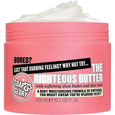
Soap & Glory
There’s never been anything minimal about the use of packaging copy by Soap & Glory. Clever, witty, smile-inducing and hard to ignore.
What can you learn from these brands for your packaging copy?
It doesn’t matter what category or industry you’re in, there’s something to learn from everything around you. There are also constraints, regulations, requirements that are specific to the area you work in as well. That doesn’t mean they have to rule what you do. All the examples above understand their regulatory frameworks but make them work for them.
Before you start, I have six key things for you to consider before you get started, as the set up to making stand out packaging copy:
Number one: Everyone can write
Ignore what they told you at school, at university. You can write. You might choose not to write, but if it’s your job to write packaging copy, then you can.
Number two: A blank screen or page is scary
Trust me, I’m a writer. I have the fear of the blank screen too.
Number three: Don’t waste your words
No product is ever low-quality. Nothing is ever last to market. No one says they are not innovative. Don’t waste your words or your customer’s time by saying your product is high-quality, innovative or first to market. If that’s all you’ve got to say, then maybe you need a rethink.
Number four: Keep it brief
I’ll qualify that. Keep it as brief as it needs to be when it needs to be. If it’s a warning to avoid life and death or serious maiming, don’t miss anything out. If you’re on your third paragraph about a washing up liquid, it’s time to find the delete button.
Number five: Don’t lie
This isn’t just about packaging copy, although it applies here. In an age of ever-increasing expectations of transparency, if you don’t lie, then there’s nothing to get caught out on.
Number six: Be creative
I think what the examples show is that just because your packaging copy doesn’t have long to grab someone’s attention doesn’t mean it should be dull. Far from it. Find your voice and really use it. Don’t try to be anyone else, and don’t be dull.
Stand out whatever your industry
Finally, of course, it’s difficult if your product is in a highly regulated sector. There are limits to the creativity you can apply to your copy. For everyone else, there is no excuse not to create something memorable, something with stand out.
If you’ve only got 0.75 seconds, make it count.


